The new MLB uniforms have not been popular. From overly revealing to cheap feeling, the uniform has come up short at pretty much every opportunity. That's a problem.
Major League Baseball should be the epitome of the sport, with its presentation the most elevated at all. It's become a cliche to talk about how green the grass appears when you first step into an MLB stadium and walk to your seats, but it's overused for a reason: it's true.
The stadiums are beautiful. (Not you, Tropicana). The players are the best in the world. It's a step above what your independent league or minor league team can offer.
The uniforms should be as well. And right now, they're not. The names are small. The sweat stains are big. The pants and jerseys having mismatched gray colors. They're just a mess all around.
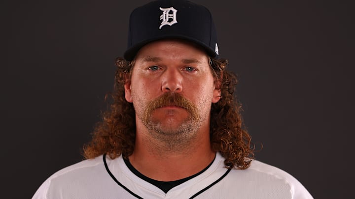
Andrew Chafin sums up what's wrong with the new MLB uniforms
Stephen Nesbitt and Tyler Kepner spoke to several MLB players for a story about the uniform's shortcomings (subscription required) at The Athletic, and they did not hold back.
Detroit Tigers reliever Andrew Chafin may have summed it up best with what he said.
My favorite quote from today’s story on the MLB/Nike uniform fiasco, with @stephenjnesbitt at @TheAthletic, comes from the Tigers’ Andrew Chafin. Amen. pic.twitter.com/ZtaWEo404L
— Tyler Kepner (@TylerKepner) April 4, 2024
"They're not bad jerseys," Chafin summed up for The Athletic. "Just in my opinion, they're not big-league jerseys."
You can see some of the differences in the two photos below of Matt Vierling in the Tigers' away uniform. And one thing that sticks out right out beyond the name is the MLB logo having moved lower, pushing everything down.
2024 Detroit Tigers jersey back

2023 Detroit Tigers jersey back

The older jerseys just looked more colorful, the names and fonts more sustantial. It's just a downgrade in every possible way this year.
Just a failed effort all around by MLB, Nike, and uniform manufacturer Fanatics alike.
And the low, low price for fans to own their own version? Still in the hundreds of dollars.
Nike has to fix this mistake
The MLB Players Union itself has weighed in on the issue, with president Tony Clark quoted in Sportico saying:
“I’d like to think we can work our way through this [uniform issue] in the best interest of all involved independent of language in a CBA,” Clark said. “This is more a reflection of what the league and Nike were interested in. I’m confident we can resolve these issues as we have in the past as long as the fit is OK.”
At least Nike acknowledges the mistake. In both The Athletic article and the one in Sportico, they say this is not a finished product and they'll continue to work to get them where they want to be.
Whether they do remains to be seen. But right now, they've left no one at all happy with their effort.
