%20%20--%3E%0A%3Csvg%20version%3D%221.1%22%20xmlns%3D%22http%3A%2F%2Fwww.w3.org%2F2000%2Fsvg%22%20xmlns%3Axlink%3D%22http%3A%2F%2Fwww.w3.org%2F1999%2Fxlink%22%20x%3D%220px%22%20y%3D%220px%22%0A%09%20viewBox%3D%220%200%201264.4%20200%22%20style%3D%22enable-background%3Anew%200%200%201264.4%20200%3B%22%20xml%3Aspace%3D%22preserve%22%3E%0A%3Cstyle%20type%3D%22text%2Fcss%22%3E%0A%09.st0%7Bfill%3A%23231F20%3B%7D%0A%09.st1%7Bfill%3A%230C2340%3B%7D%0A%09.st2%7Bfill%3A%23FA4616%3B%7D%0A%09.st3%7Bfill%3A%23FFFFFF%3B%7D%0A%3C%2Fstyle%3E%0A%3Cg%20id%3D%22Template%22%3E%0A%3C%2Fg%3E%0A%3Cg%20id%3D%22Layer_2%22%3E%0A%09%3Cg%3E%0A%09%09%3Cpath%20class%3D%22st2%22%20d%3D%22M58.4%2C131.6v-23.4l-10.1%2C23.4H29.6l-10.2-23.4v23.4H0V76.7h23.5l16.3%2C34.1L56%2C76.7h22v54.9H58.4z%22%2F%3E%0A%09%09%3Cpath%20class%3D%22st2%22%20d%3D%22M110.6%2C131.6c-3.9%2C0-7.2-0.2-9.9-0.5c-2.7-0.4-4.8-1-6.4-2c-1.6-0.9-2.8-2.3-3.5-4c-0.7-1.7-1.1-3.9-1.1-6.6%0A%09%09%09V89.9c0-2.7%2C0.4-4.9%2C1.1-6.6c0.7-1.7%2C1.9-3.1%2C3.6-4c1.7-1%2C3.8-1.6%2C6.5-2c2.7-0.3%2C5.9-0.5%2C9.8-0.5h27.8c3.9%2C0%2C7.2%2C0.2%2C9.9%2C0.5%0A%09%09%09c2.7%2C0.3%2C4.9%2C1%2C6.5%2C2c1.7%2C1%2C2.8%2C2.3%2C3.6%2C4c0.7%2C1.7%2C1.1%2C3.9%2C1.1%2C6.6v28.6c0%2C2.8-0.4%2C5-1.1%2C6.7c-0.7%2C1.7-1.9%2C3-3.6%2C4%0A%09%09%09c-1.7%2C1-3.8%2C1.6-6.5%2C2c-2.7%2C0.3-6%2C0.5-9.9%2C0.5H110.6z%20M138.7%2C94.4c0-1.4-0.4-2.4-1.2-2.9c-0.8-0.5-2.5-0.8-4.9-0.8h-15.8%0A%09%09%09c-2.3%2C0-3.9%2C0.2-4.8%2C0.7c-0.9%2C0.5-1.3%2C1.5-1.3%2C3v19.5c0%2C1.4%2C0.4%2C2.4%2C1.2%2C2.9c0.8%2C0.6%2C2.4%2C0.8%2C5%2C0.8h15.8c2.4%2C0%2C4.1-0.3%2C4.9-0.8%0A%09%09%09c0.8-0.5%2C1.2-1.5%2C1.2-2.9V94.4z%22%2F%3E%0A%09%09%3Cpath%20class%3D%22st2%22%20d%3D%22M187.7%2C131.6V90.7h-19.9V76.7h60.8v13.9h-19.8v40.9H187.7z%22%2F%3E%0A%09%09%3Cpath%20class%3D%22st2%22%20d%3D%22M257.9%2C131.6c-3.9%2C0-7.2-0.2-9.9-0.5c-2.7-0.4-4.8-1-6.4-2c-1.6-0.9-2.8-2.3-3.5-4c-0.7-1.7-1.1-3.9-1.1-6.6%0A%09%09%09V89.9c0-2.7%2C0.4-4.9%2C1.1-6.6c0.7-1.7%2C1.9-3.1%2C3.6-4c1.7-1%2C3.8-1.6%2C6.5-2s5.9-0.5%2C9.8-0.5h27.8c3.9%2C0%2C7.2%2C0.2%2C9.9%2C0.5%0A%09%09%09c2.7%2C0.3%2C4.9%2C1%2C6.5%2C2c1.7%2C1%2C2.8%2C2.3%2C3.6%2C4c0.7%2C1.7%2C1.1%2C3.9%2C1.1%2C6.6v28.6c0%2C2.8-0.4%2C5-1.1%2C6.7c-0.7%2C1.7-1.9%2C3-3.6%2C4%0A%09%09%09c-1.7%2C1-3.8%2C1.6-6.5%2C2c-2.7%2C0.3-6%2C0.5-9.9%2C0.5H257.9z%20M285.9%2C94.4c0-1.4-0.4-2.4-1.2-2.9c-0.8-0.5-2.5-0.8-4.9-0.8H264%0A%09%09%09c-2.3%2C0-3.9%2C0.2-4.8%2C0.7c-0.9%2C0.5-1.3%2C1.5-1.3%2C3v19.5c0%2C1.4%2C0.4%2C2.4%2C1.2%2C2.9c0.8%2C0.6%2C2.4%2C0.8%2C5%2C0.8h15.8c2.4%2C0%2C4.1-0.3%2C4.9-0.8%0A%09%09%09c0.8-0.5%2C1.2-1.5%2C1.2-2.9V94.4z%22%2F%3E%0A%09%09%3Cpath%20class%3D%22st2%22%20d%3D%22M363.3%2C131.6v-14.9c0-1.3-0.3-2.2-1-2.8c-0.7-0.6-2-0.9-4.1-0.9h-18.8v18.7h-20.9V76.7h46.4%0A%09%09%09c3.9%2C0%2C7.1%2C0.2%2C9.5%2C0.7c2.5%2C0.4%2C4.4%2C1.2%2C5.8%2C2.2c1.4%2C1%2C2.3%2C2.4%2C2.9%2C4c0.5%2C1.7%2C0.8%2C3.7%2C0.8%2C6.2v8.6c0%2C2.4-0.5%2C4.3-1.6%2C5.7%0A%09%09%09c-1.1%2C1.4-2.5%2C2.3-4.3%2C2.8c1.6%2C0.4%2C3%2C1.2%2C4.3%2C2.5c1.3%2C1.3%2C1.9%2C3.1%2C1.9%2C5.3v16.8H363.3z%20M363.3%2C93.9c0-1.1-0.2-1.9-0.7-2.4%0A%09%09%09c-0.5-0.6-1.6-0.8-3.3-0.8h-20v9.7h20c1.8%2C0%2C2.9-0.3%2C3.4-0.9c0.4-0.6%2C0.6-1.6%2C0.6-2.8V93.9z%22%2F%3E%0A%09%09%3Cpath%20class%3D%22st2%22%20d%3D%22M447.5%2C131.6c-3.9%2C0-7.2-0.2-9.9-0.5c-2.7-0.4-4.9-1-6.5-2c-1.7-1-2.9-2.3-3.6-4c-0.7-1.7-1.1-3.9-1.1-6.6%0A%09%09%09V89.9c0-2.7%2C0.4-4.8%2C1.1-6.6c0.7-1.7%2C1.9-3.1%2C3.6-4c1.7-1%2C3.8-1.6%2C6.5-2c2.7-0.4%2C6-0.5%2C9.9-0.5h42.2v13.9h-36.2%0A%09%09%09c-2.2%2C0-3.8%2C0.3-4.6%2C0.9c-0.9%2C0.6-1.3%2C1.5-1.3%2C2.8v19.5c0%2C2.5%2C2%2C3.7%2C6%2C3.7h36.2v13.9H447.5z%22%2F%3E%0A%09%09%3Cpath%20class%3D%22st2%22%20d%3D%22M500.8%2C131.6V76.7h20.9v54.9H500.8z%22%2F%3E%0A%09%09%3Cpath%20class%3D%22st2%22%20d%3D%22M551.2%2C131.6V90.7h-19.9V76.7h60.8v13.9h-19.8v40.9H551.2z%22%2F%3E%0A%09%09%3Cpath%20class%3D%22st2%22%20d%3D%22M621%2C131.6v-23.2L598%2C76.7h26.1l8.5%2C14.3l8.6-14.3h24.5l-23.9%2C31.6v23.2H621z%22%2F%3E%0A%09%3C%2Fg%3E%0A%09%3Cg%3E%0A%09%09%3Cpath%20class%3D%22st3%22%20d%3D%22M775.3%2C102.1c-1.2-1.7-2.7-3.4-4.1-4.8c9.2-1.7%2C18.1-5.8%2C25.4-11.6c12.8-10.4%2C19.1-24.9%2C19.1-38.4%0A%09%09%09c0-44-52.4-56.5-84.3-40.8c-9.2%2C4.6-17.1%2C11.1-23.2%2C19.1c-9.2%2C11.8-22%2C41.8%2C8.7%2C38.7C691.2%2C20%2C782.3-9.2%2C790.5%2C38.1%0A%09%09%09c0.5%2C2.4%2C0.7%2C4.6%2C0.7%2C6c0%2C20.5-20.1%2C34.8-37.7%2C28.3c8.2-14.5%2C8.2-21.3%2C7.5-26.8c-1-10.6-13.5-13.8-13.5-13.8l-7%2C12.3l-13.3%2C23%0A%09%09%09l-17.6%2C29.7c-0.5%2C0.7-1%2C1.4-1.2%2C2.2c-23.4-0.7-41.1%2C15.5-43.7%2C38.7c-3.9%2C34.5%2C29%2C55.3%2C58%2C55.3c35.5%2C0%2C62.6-29.2%2C62.6-59.9%0A%09%09%09c0-10.4-2.9-20.8-9.9-30.7V102.1z%20M755%2C126.8c-2.7%2C32.6-47.3%2C59.4-72.5%2C26.8c-7.2-9.4-1.9-32.9%2C17.9-40.1l1.4%2C0.2%0A%09%09%09c-6.3%2C19.3-2.2%2C36%2C22.2%2C33.1c-2.9-11.4-0.2-20.5%2C16.2-50.5v-0.2c1.9%2C0.7%2C3.9%2C1%2C5.8%2C1.2C754.2%2C106.5%2C755.7%2C117.1%2C755%2C126.8z%22%2F%3E%0A%09%09%3Cpath%20class%3D%22st3%22%20d%3D%22M1256.4%2C92c-2.3%2C0-5%2C0.8-7.7%2C3.1c-4.6%2C4.1-5.2%2C11.4-3.7%2C17.6c0.5%2C2.3%2C0.6%2C4.2%2C0.9%2C6.3%0A%09%09%09c-3.4%2C3.4-7.1%2C6.4-10.8%2C8.6c-0.4-6.4-3.1-11.8-6.6-17.4c-3.9-6-4.1-12.8-2.3-19.3c3.7-14.5%2C8.9-0.6%2C6.2%2C2.7%0A%09%09%09c14.3-4.6%2C8.1-19.3-0.8-21.1c-17.4-3.3-28.2%2C19.1-19.5%2C31.9c7.3%2C10.8%2C6.4%2C27.8-6.2%2C27.2c-6.8-0.3-12.2-4.9-12.4-17.8%0A%09%09%09c1.9-5.2%2C2.5-9.7%2C1.1-12.3c-0.1%2C0.4-0.2%2C0.7-0.3%2C1.1c0.1-0.4%2C0.1-0.7%2C0.1-1.1c-4.1%2C4.2-7%2C9.8-8.7%2C16c-12.4%2C14-32.2%2C22.5-22.3%2C0.8%0A%09%09%09l0.2-0.2l42.1-72.7c10.2-17.6%2C7.7-27-4.6-32.7l-12.2%2C21.4l-45.2%2C78.1c-0.9%2C1.5-1.9%2C3.6-2.9%2C5.8c-12.5%2C13.6-31.5%2C21.5-21.7%2C0.2%0A%09%09%09l0.2-0.2l9.7-16.6c10.2-17.6%2C7.7-27.1-4.6-32.7l-11.8%2C20.7c-7.4-32.8-52.3-13.2-64.6%2C23.1c-8.5%2C11.6-24.4%2C21.2-29.4%2C18.4%0A%09%09%09c5.8-11.4%2C12.6-24.7%2C18.6-37.9c3.3-6.6%2C4.4-10%2C4.1-13.3c-0.8-8.5-10.8-11-10.8-11l-2.3%2C3.9c-3.1%2C4.6-6.2%2C10.1-9.5%2C16%0A%09%09%09c-8-31.6-52.4-11.8-64.5%2C24.4c-11.7%2C16.4-37%2C29.2-26%2C5.4l0.2-0.2c6.2-11.6%2C12.6-22.4%2C8.7-35c-2.5-8.1-11-12-18.6-12%0A%09%09%09c-6.6%2C0-12.8%2C3.9-18.4%2C9.5c-0.2-0.4-0.2-0.6-0.2-1c-0.8-8.5-10.8-11-10.8-11l-12.2%2C21.4l-6.7%2C11.3c0-0.1%2C0-0.2-0.1-0.3%0A%09%09%09c-0.3%2C0.8-0.7%2C1.4-1%2C2.1l-5.3%2C8.9c-0.7%2C1.1-1.2%2C2.3-1.8%2C3.5c-19.6%2C27.2-47.9%2C21.7-45%2C0.2c16.2%2C6.2%2C39-10%2C36.9-30.1%0A%09%09%09c-1-7.5-7-11.6-14.9-12.8c-9.1-1.3-21.1%2C4.6-30.3%2C15.1c-19.5%2C21.6-22.8%2C65.3%2C13.1%2C65.3c9.3%2C0%2C22.3-3.5%2C33.9-16.9%0A%09%09%09c-0.3%2C10.2%2C4.9%2C17.5%2C19.6%2C15.8c0.2-7.1%2C1.7-13.7%2C3.7-19.7c2.9-6.4%2C26.7-57.8%2C39.4-52c4.6%2C2.9%2C0.4%2C10.6-0.6%2C12.4%0A%09%09%09c-9.5%2C18-29.8%2C45.2-9.7%2C57.6c13.6%2C8.1%2C32.3-8%2C43.2-24.3c-1%2C14.9%2C7.5%2C26.8%2C22.4%2C26.8c4.1%2C0%2C7.7-1%2C11.4-2.7l-5.4%2C8.9%0A%09%09%09c-22.2%2C36.1-41.4%2C26.1-74.6%2C12.2c-13.5-5.6-24.5-6.6-32.7-4.2c-17.2%2C4.6-22.2%2C22.4-15.5%2C32.8c15.5-23%2C44.4-9.7%2C71.1-3.1%0A%09%09%09c45.2%2C11.2%2C61.1-11.6%2C82.1-50.1c12.1%2C4.2%2C26-7%2C34.8-19.7c-0.5%2C14.4%2C7.9%2C25.7%2C22.5%2C25.7c9.9%2C0%2C18.6-5.8%2C25.5-12.8%0A%09%09%09c1.2%2C3.9%2C3.7%2C7.5%2C8.3%2C10.2c11.1%2C6.6%2C25-2.8%2C35.3-15.4c0.2%2C5.7%2C2.4%2C11.3%2C9%2C15.4c12.4%2C7.4%2C28.2-5.2%2C38.6-19.7%0A%09%09%09c0.4%2C13.6%2C7%2C25.9%2C21.7%2C25.9c2.3%2C0%2C5.2-0.4%2C7.7-1.2c6.6-1.9%2C11.6-5.4%2C15.3-10.2c6.4-3.1%2C12.6-8.9%2C17.5-15.3%0A%09%09%09c-2.1%2C56.5-102.2%2C36-171.1%2C36c-34%2C0-62.4-3.3-58.9%2C32.7c50.6-35.8%2C236.1%2C13.5%2C239-66.1c0.2-3.5%2C0.2-7.3-0.2-11.4%0A%09%09%09C1270.3%2C102.8%2C1263.9%2C92%2C1256.4%2C92z%20M830.9%2C91c6.8-7.5%2C11.6-5.2%2C12-1c0.6%2C11.6-16%2C23-24.2%2C19.7C820.8%2C104.4%2C824.7%2C98%2C830.9%2C91z%0A%09%09%09%20M1009.9%2C105.7l-3.1%2C6.4c-7.1%2C3.3-10.6%2C8.3-11.2%2C13.7c-4.3%2C3.5-9.7%2C6-15.9%2C6c-8.5%2C0-5.6-10.6-3.7-15.5%0A%09%09%09C984%2C94.1%2C1018.9%2C62.6%2C1009.9%2C105.7z%20M1103.8%2C104.9l-3.3%2C5.6c0%2C0-0.2%2C0.2-0.2%2C0.4l-0.8%2C1.3l-1.7%2C3.1c-3.9%2C6.2-12%2C16.2-24.3%2C16.2%0A%09%09%09c-8.5%2C0-5.6-10.6-3.7-15.5C1077.7%2C94.1%2C1112.5%2C62.8%2C1103.8%2C104.9z%22%2F%3E%0A%09%3C%2Fg%3E%0A%3C%2Fg%3E%0A%3C%2Fsvg%3E%0A)


The Detroit Tigers have one of the most iconic uniforms in all of professional sports. Yet here we look at five times the team went off-script.
The Detroit Tigers have one of the most iconic uniforms in all of professional sports. The old English D has always been one of the most highly regarded logos in baseball, while the Tigers have also had one of my favorite road uniforms. Both the block lettering from years ago and the cursive script used today have always been a great look.
Yet the Tigers have done some experimenting with their uniforms over the years, and some of the results were pretty strange. Here we look at five times that the Tigers went off-script.
1927: One of a few times that the Tigers decided to abandon the old English D for a short time, for one year, in 1927, they used a Tiger’s head as the logo on the left side of the jersey. As we can see, the logos are different on the home and away jerseys. I know I’m viewing this through the lens of almost 100 years, but that road logo just looks creepy. Thankfully, this lasted only one season, and after wearing it on the back of the 1928 jerseys, this experiment was ended altogether.
1960: The Tigers have rarely worn “Tigers” on their jerseys. The road uniforms mentioned above did so in 1928, and in 1960 the team wore “Tigers” on the home jerseys instead of the English D. For some reason, club president William O. DeWitt wanted to make this change, but he then left for the Cincinnati Reds after the 1960 season. Thankfully, the English D was restored for the following year. This may have brought some good karma; the Tigers went from 71-83 in 1960 to 101-61 in 1961.
1968: This was a great year as the Tigers won the World Series, yet one part of their road uniform remains a mystery. Some players wore the uniform number on the left sleeve, while others wore it on the right sleeve. Read this article to see a list of players on both sides; though the author provides a few possible reasons why this may have happened, what’s particularly strange is that Willie Horton wore them on different sleeves in different games during the World Series.
1994: After wearing the block DETROIT lettering on the road from 1972 to 1993, the Tigers went back to the traditional cursive script in 1994; though I prefer the cursive, you can’t go wrong with either one. Yet in the strike-shortened season of 1994, the team wore thick stripes down both the sleeves and the sides of the pants. (Get a better look by clicking here.) I don’t understand why that happened, or who thought that was a good idea, but the team abandoned that after just one season.
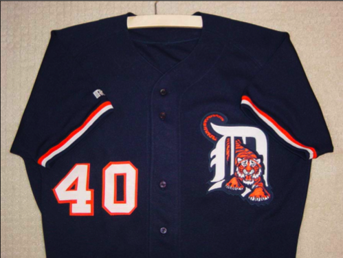
1995: The Tigers, thankfully, have rarely dabbled into “alternate” jerseys the way that the majority of other teams have; I still prefer home whites and road grays. Yet on May 7, 1995, for some reason, the Tigers tried out these navy blue alternates, in a game against the Boston Red Sox, at home. The jerseys were navy blue, with the Tiger jumping through the English D, as was on the road caps for a few years in the 1990s. In what was perhaps bad karma, the Red Sox pounded the Tigers, 12-1. Team president John McHale reportedly claimed that the jerseys “just don’t look like the Tigers,” and this experiment was quickly abandoned.